Vous souhaitez ajouter un fond animé à votre site web sans l’alourdir avec une vidéo. Alors, je vous invite à découvrir ce générateur de backgrounds animés en CSS.
3 démos sont disponibles et vous pouvez personnaliser très facilement la démo de votre choix. Vous pourrez récupérer le code pour l’utiliser facilement sur votre site internet.
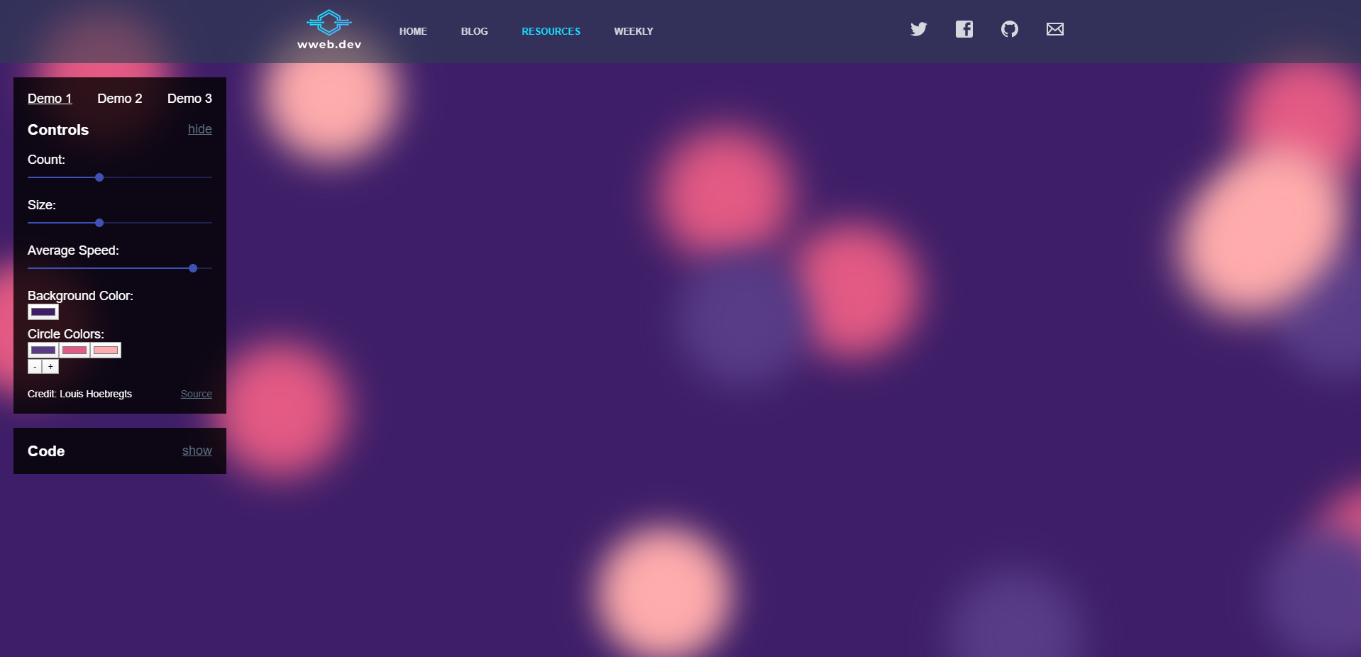
Pour l’aperçu ci-dessus le code à intégrer est le suivant :
- la partie HTML :
<div class="background">
<span></span>
<span></span>
<span></span>
<span></span>
<span></span>
<span></span>
<span></span>
<span></span>
<span></span>
<span></span>
<span></span>
<span></span>
<span></span>
<span></span>
<span></span>
<span></span>
<span></span>
<span></span>
<span></span>
<span></span>
</div>
- la partie CSS :
@keyframes move {
    100% {
        transform: translate3d(0, 0, 1px) rotate(360deg);
    }
}

.background {
    position: fixed;
    width: 100vw;
    height: 100vh;
    top: 0;
    left: 0;
    background: #3E1E68;
    overflow: hidden;
}

.background span {
    width: 20vmin;
    height: 20vmin;
    border-radius: 20vmin;
    backface-visibility: hidden;
    position: absolute;
    animation: move;
    animation-duration: 45;
    animation-timing-function: linear;
    animation-iteration-count: infinite;
}


.background span:nth-child(0) {
    color: #FFACAC;
    top: 71%;
    left: 57%;
    animation-duration: 55s;
    animation-delay: -48s;
    transform-origin: 25vw 17vh;
    box-shadow: -40vmin 0 5.475471058767184vmin currentColor;
}
.background span:nth-child(1) {
    color: #583C87;
    top: 3%;
    left: 3%;
    animation-duration: 7s;
    animation-delay: -25s;
    transform-origin: 14vw 8vh;
    box-shadow: 40vmin 0 5.3638245158751285vmin currentColor;
}
.background span:nth-child(2) {
    color: #583C87;
    top: 13%;
    left: 40%;
    animation-duration: 10s;
    animation-delay: -36s;
    transform-origin: 13vw 17vh;
    box-shadow: -40vmin 0 5.063323438010432vmin currentColor;
}
.background span:nth-child(3) {
    color: #583C87;
    top: 25%;
    left: 57%;
    animation-duration: 25s;
    animation-delay: -37s;
    transform-origin: -21vw 6vh;
    box-shadow: -40vmin 0 5.9019939201704075vmin currentColor;
}
.background span:nth-child(4) {
    color: #E45A84;
    top: 17%;
    left: 93%;
    animation-duration: 54s;
    animation-delay: -1s;
    transform-origin: -10vw 12vh;
    box-shadow: 40vmin 0 5.087804900562675vmin currentColor;
}
.background span:nth-child(5) {
    color: #583C87;
    top: 73%;
    left: 32%;
    animation-duration: 30s;
    animation-delay: -2s;
    transform-origin: -20vw -23vh;
    box-shadow: -40vmin 0 5.203032032618411vmin currentColor;
}
.background span:nth-child(6) {
    color: #E45A84;
    top: 82%;
    left: 31%;
    animation-duration: 52s;
    animation-delay: -5s;
    transform-origin: -8vw -14vh;
    box-shadow: 40vmin 0 5.274497883189334vmin currentColor;
}
.background span:nth-child(7) {
    color: #FFACAC;
    top: 68%;
    left: 73%;
    animation-duration: 34s;
    animation-delay: -23s;
    transform-origin: 6vw -4vh;
    box-shadow: -40vmin 0 5.965035797871222vmin currentColor;
}
.background span:nth-child(8) {
    color: #FFACAC;
    top: 47%;
    left: 83%;
    animation-duration: 25s;
    animation-delay: -4s;
    transform-origin: 20vw -8vh;
    box-shadow: -40vmin 0 5.709503055213773vmin currentColor;
}
.background span:nth-child(9) {
    color: #E45A84;
    top: 49%;
    left: 80%;
    animation-duration: 17s;
    animation-delay: -10s;
    transform-origin: 10vw -6vh;
    box-shadow: 40vmin 0 5.01741502652619vmin currentColor;
}
.background span:nth-child(10) {
    color: #E45A84;
    top: 22%;
    left: 36%;
    animation-duration: 23s;
    animation-delay: -39s;
    transform-origin: 2vw 5vh;
    box-shadow: 40vmin 0 5.992099872461056vmin currentColor;
}
.background span:nth-child(11) {
    color: #FFACAC;
    top: 58%;
    left: 99%;
    animation-duration: 53s;
    animation-delay: -46s;
    transform-origin: 1vw -2vh;
    box-shadow: -40vmin 0 5.732471143525998vmin currentColor;
}
.background span:nth-child(12) {
    color: #FFACAC;
    top: 30%;
    left: 46%;
    animation-duration: 50s;
    animation-delay: -13s;
    transform-origin: -1vw -5vh;
    box-shadow: -40vmin 0 5.2892355107440805vmin currentColor;
}
.background span:nth-child(13) {
    color: #583C87;
    top: 6%;
    left: 10%;
    animation-duration: 25s;
    animation-delay: -21s;
    transform-origin: 4vw -19vh;
    box-shadow: -40vmin 0 5.570193173767737vmin currentColor;
}
.background span:nth-child(14) {
    color: #E45A84;
    top: 57%;
    left: 19%;
    animation-duration: 42s;
    animation-delay: -49s;
    transform-origin: -15vw 7vh;
    box-shadow: 40vmin 0 5.102584783977585vmin currentColor;
}
.background span:nth-child(15) {
    color: #FFACAC;
    top: 83%;
    left: 51%;
    animation-duration: 38s;
    animation-delay: -40s;
    transform-origin: 4vw -8vh;
    box-shadow: -40vmin 0 5.845897450444361vmin currentColor;
}
.background span:nth-child(16) {
    color: #E45A84;
    top: 69%;
    left: 65%;
    animation-duration: 28s;
    animation-delay: -3s;
    transform-origin: 25vw 16vh;
    box-shadow: 40vmin 0 5.5897568143551055vmin currentColor;
}
.background span:nth-child(17) {
    color: #FFACAC;
    top: 27%;
    left: 5%;
    animation-duration: 23s;
    animation-delay: -18s;
    transform-origin: 19vw 0vh;
    box-shadow: 40vmin 0 5.736472025401282vmin currentColor;
}
.background span:nth-child(18) {
    color: #E45A84;
    top: 30%;
    left: 70%;
    animation-duration: 19s;
    animation-delay: -32s;
    transform-origin: 24vw 1vh;
    box-shadow: -40vmin 0 5.0849280816458915vmin currentColor;
}
.background span:nth-child(19) {
    color: #FFACAC;
    top: 38%;
    left: 67%;
    animation-duration: 31s;
    animation-delay: -21s;
    transform-origin: 19vw 12vh;
    box-shadow: -40vmin 0 5.665153718066155vmin currentColor;
}
Site officiel : https://wweb.dev/resources/animated-css-background-generator
* * Cette case à cocher est obligatoire
*J'accepte